
I'm writing my project proposal. My sister and friend are in the same room watching Buffy. It may seem ironic (or normal!), but I'm really struggling to distract myself from it, or perhaps not allow myself to become distracted.
Is it the pretty glow radiating from the screen? The engaging and attention seeking soundtrack? Or because (in JD from Scrubs' words), I'm a self-saboteur? Is it based in the opportunity for narrative absorption, escapism? If so, is it because we enjoy narrative, because it explores themes and issues that we all deal with, the human condition, and the writers have managed to make sense of it. There's resolution, motivation, reason. And a formula to boot. Answers, unfolding right in front of us. The alternative; life, is (seemingly) never-ending. We rarely experience the satisfaction of complete resolution. Narrative provides us with the satisfaction of resolution.
And if the desire for narrative is the main driving force behind our escapism tendencies, as opposed to the new opportunities provided by technology, then we have a long and complex history to deal with... perhaps beginning with the Dreamtime stories. But then you raise a whole new set of questions. Are stories created for entertainment or educational purposes?
Another series of issues to continue to explore.
Thursday, 3 April 2008
Wednesday, 2 April 2008
artists statement
A Chaotic New World - faq
Modern western civilisation, especially current generations, are exposed to the biggest height in consumer culture and globalisation in history. The effects have imbedded themselves so extremely in our lives that it’s almost impossible to notice. In fact, we are, in many ways for many reasons, conditioned not to. It reminds me of a saying about trees and the forest.
Q. How do we deal with it all?
A. Escape.
Q. How do you do it?
A. Be somewhere else. An alternative reality or perception often works.
Q. Where can we find these alternatives?
A. Just look into a television, computer, phone, iPod, camera, etc. Generally somewhere with a screen.
Q. Why a screen?
A. People are attracted to light. Stimulation. Escapism. There’s often some form of narrative happening. It helps aid distraction.
Q. Why do we do this?
A. Life is difficult. There’s a lot going on. Time is precious. When we can, we prefer not to get too bogged down in it all. It’s a bit contradictory though, because we’re generally looking for stimulation. Stimulation is information. And if we use narrative as an example, the more chaos, stimulation, and information, the deeper we can immerse ourselves in it, and the deeper the immersion, the more we enjoy that distraction.
Q. That sounds a bit complicated… chaotic even.
A. That’s how it is for me. I want to dissect it all. So that it’s less chaotic. We think we like order more than chaos. Like anything, it’s not that simple. I’m going to try and work it all out using images. To create some kind of order out of this mess.
Q. How? Why?
A. We’re exposed to over 30,000 images every day. We understand them. How to read them, what they mean. We’re still susceptible to their manipulation, which is another theme I hope to explore. I believe images are the primary form of escape. So it makes sense to use them to communicate my findings.
How will your images illustrate your findings?
I’ll shoot images of people while they’re in the state of escape. This will at first appear meaningless, it’s something we see all the time. Which is part of the point, because we are so immersed in it. The form of the images, my choice of communication method; the fine art print, in an exhibition setting, will suggest that there’s more to it than that. The elements and construction of the images will provide clues for the viewer to read. Ideally, after a bit of consideration, the viewer should be able to understand the meaning and metaphors I have placed within the photographs.
how i got here
The following images were part of the basis for this idea. It probably started around the time that a friend of mine, who was in her final year of performance studies, was creating an installation based on video works that we worked on together, including an animation from an earlier post. Although the themes are quite different, I can see the link, or perhaps development of this idea from then until now. I was particularly interested in the viewer, identity, and screen-based media.


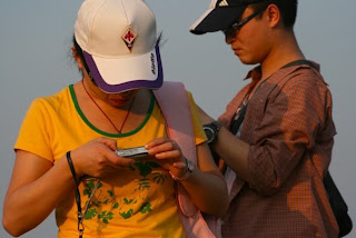
Next up was when my sister and I were watching the sunset. Only we weren't really watching it, just shooting it until it lost its attractiveness.

The next time was when I was checking out the ruins of Angkor. One of the sites had just wrapped up filming a Thai film. A young local was obviously influenced. It stood out only because the clichéd realisation that we all know but begin to really get when we travel... that life, when simple, and with limited resources, often appears much more relaxed and content. So it can be kind of confusing when you see the locals desiring the alternative western consumer driven culture.

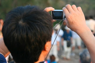
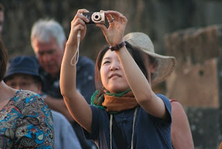
And then, tourism/the veiwer/photography/location (where are you?). At the summit of a small mountain overlooking Angkor Wat for sunset, the amount of people, the chaotic search for the best view, and the amount of cameras, really just blew me away. That was for me, much more captivating than the sunset.


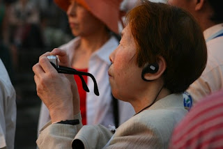

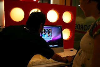
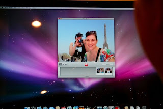
I'm just as bad. Especially as a tourist. At least most people only get their cameras out at the same time as everyone else. Inconspicuousness, not always my thing. I got a bit over excited when I found a Borders in Kuala Lumpur. And, even better, the Borders had an Apple store in it. The sales guy was taking our photo in PhotoBooth, of which I was taking photo's, of myself, with a fake Parisian background. So perhaps even when we're escaping, we're still escaping. To simplify.


Next up was when my sister and I were watching the sunset. Only we weren't really watching it, just shooting it until it lost its attractiveness.

The next time was when I was checking out the ruins of Angkor. One of the sites had just wrapped up filming a Thai film. A young local was obviously influenced. It stood out only because the clichéd realisation that we all know but begin to really get when we travel... that life, when simple, and with limited resources, often appears much more relaxed and content. So it can be kind of confusing when you see the locals desiring the alternative western consumer driven culture.

And then, tourism/the veiwer/photography/location (where are you?). At the summit of a small mountain overlooking Angkor Wat for sunset, the amount of people, the chaotic search for the best view, and the amount of cameras, really just blew me away. That was for me, much more captivating than the sunset.


I'm just as bad. Especially as a tourist. At least most people only get their cameras out at the same time as everyone else. Inconspicuousness, not always my thing. I got a bit over excited when I found a Borders in Kuala Lumpur. And, even better, the Borders had an Apple store in it. The sales guy was taking our photo in PhotoBooth, of which I was taking photo's, of myself, with a fake Parisian background. So perhaps even when we're escaping, we're still escaping. To simplify.


how we got here
image as a political tool/propoganda
|
industrial revolution/politics
|
globalisation/consumerism
|
mass media/marketing
|
consumption/identity/psychology
|
chaos
|
dissatisfaction/desire for stimulation/escapism
|
industrial revolution/politics
|
globalisation/consumerism
|
mass media/marketing
|
consumption/identity/psychology
|
chaos
|
dissatisfaction/desire for stimulation/escapism
review I 2008

 The Digital Fine Print, Wednesday 9:30-1:30
Assessment 1 [25%]: Class Project – Week 4
This is a technical competency project to determine each student’s ability to identify and consider aspects of a digital fine print. Students present printed work that demonstrates an ability to make quality prints.
Class Project Assessment Criteria:
Presentation [25%]:
Presented images need to reflect a consideration of the relationship between the content of the image and the printing of the image.
Evidence of technical investigation [25%]:
Provide evidence of technical research that has informed and contributed to the production of the work. Evidence can be from a variety of resources, including the internet, books and journals. This should be presented in the form of an annotated bibliography.
Evidence of technical competency [25%]:
Provide evidence of technical competency and understanding of the key considerations for the making of a print. This can include use of technology, an understanding of terminology or a combination of skills. This should form the basis for the oral presentation.
Artist Statement [25%]:
Provide evidence, in the form of a typed artist statement, of the nature of the work in relation to the influence[s] and concepts.
Fine Art Photography Project 1a, Friday 2:30-6:30
Assessment 1 [25%]: Class Project – Week 4
This is a visual presentation of the project proposal, including preliminary research and investigations.
Class Project Assessment Criteria:
Presentation [25%]:
Presented images should reflect an engagement with technique and technical competency. The basis of this should be a demonstrated understanding of the realisation of your concept, proficiency of technique, and its relevance to the making of the work.
Evidence of Preliminary Investigations [25%]:
Provide evidence of the development and progress of ideas for your project. This can include examples of exhibitions you have seen or investigations of other artists’ work. It can also include films of interest, online sites or any other reference points for yourself. This should be presented in the form of a visual diary.
Evidence of Project Planning [25%]:
Provide evidence of planning for the project. This should include an analysis of projected costs for the project and relevant considerations. This should be presented in the form of a timeline and budget.
Artist Statement [25%]:
Provide evidence, in the form of a typed artist statement, of the nature of the work in relation to the influence[s] and concepts.
Advanced Studio 1 & 2, Thursday 9:30-1:30, 2:30-6:30
Assessment Review I – Project Proposal presentation
Presentation of project proposal, with support material, artist statement, project plan, references and sample images.
Assessment criteria for Assessment Project: Review I
Presentation [25%]:
Presented images should reflect the visual development of the project, in relation to the concepts and ideas. Whilst it is expected that images may be work in progress, they should demonstrate the visual aspect of the project.
Proposal [25%]:
Present and submit the completed project proposal, including the budget, timeline, investigation description and methodology.
Evidence of information and influence [25%]:
Provide evidence of theoretical and practical research that has supported and contributed to the development of the project proposal. This evidence could include books, papers, catalogues, journals, magazines, websites, film reviews, drawing, notebooks, mindmaps or any other appropriate material. This should form the basis of your bibliography, but can also be presented in other formats, for example - as workbooks.
Artist Statement [25%]:
Provide evidence, in the form of a typed artist statement, of the nature of the work in relation to the influence[s] and concepts. This should be incorporated into the Proposal.
the text reference list
This page will serve as an always updateable reference list. I will include recommendations, as well as things that I want to study, and things that I have studied. I haven't worked out the logistics of it yet but may sort by subject/author/date/status (recommended/read/want to read)... or perhaps I'll colour code in addition. Most other influences are noted as part of the blog but I guess I should list them here and perhaps link them to the original post? Open to suggestions :)
Recommended texts in The Digital Fine Print:
BIALOBRZESKI, P., RIBBAT, C. & HANIG, F. (2004) Neontigers : photographs of Asian megacities, Ostfildern-Ruit, Germany; New York, Hatje Cantz ; [Distributors] D.A.P. Distributed Art Publishers. Amazon or RMIT 770.92 B576
BLATNER, D. (2004) Real world scanning and halftones : industrial strength production techniques, Berkeley, Calif., Peachpit Press. Amazon or RMIT 686.22544 B644
BLATNER, D. (2008) Real World Adobe Photoshop Cs3 : Industrial-Strength Production Techniques, Berkeley, Peachpit Press. Amazon or RMIT 006.686 B644
CAPONIGRO, J. P. (2003) Adobe Photoshop master class : the essential guide to revisioning photography, Berkeley, Calif., Adobe Press book published by Peachpit Press. Amazon or RMIT 006.6869 A239
ELAM, K. (2001) Geometry of design : studies in proportion and composition, New York, N.Y., Princeton Architectural Press. Amazon or RMIT 701.8 E37
ENNIS, H. & NATIONAL LIBRARY OF AUSTRALIA. (2004) Intersections : photography, history and the National Library of Australia, Canberra, National Library of Australia. Amazon or RMIT 779.0749471 E59
EVENING, M. (2007) Adobe Photoshop CS3 for photographers : a professional image editor's guide to the creative use of Photoshop for the Macintosh and PC, Oxford ; Burlington, MA, Elsevier/Focal Press. Amazon or RMIT 006.686 E93
FRASER, B. (2005) Real world Camera Raw with Adobe Photoshop CS2 : industrial-strength production techniques, Berkeley, Calif., Peachpit Press. Amazon or RMIT 006.6869 F841
FRASER, B., MURPHY, C. & BUNTING, F. (2005) Real world color management : industrial-strength production techniques, Berkeley, CA, Peachpit Press. Amazon or RMIT 006.6 F841
JOHNSON, S. (2006) Stephen Johnson on Digital Photography, O'Reilly Media, Inc. Amazon
KISSELL, J. (2007) Real world Mac maintenance and backups, Berkeley, CA [S.L.], Peachpit Press ; Take Control Books. Amazon or RMIT 621.3916 K56
LONG, B. (2007) Real World Aperture, Berkeley, Calif., Peachpit Press. Amazon or RMIT 778.593 L848
MARGULIS, D. (2006) Photoshop LAB color : the canyon conundrum and other adventures in the most powerful colorspace, Berkeley, CA, Peachpit. Amazon or RMIT 006.686 M331
POGUE, D. (2007) Mac OSX: The Missing Manual, Leopard Edition, O'Reilly Media, Inc. Amazon or RMIT (Tiger) 004.165M2 P746
-------------------------------------------
Benjamin, W 1968The Work of Art in the Age of Mechanical Reproduction, from
http://fineartphotography.dsc.rmit.edu.au/?page_id=85
Berger, J 1965 Ways of Seeing Videorecording viewed March 2007
Bright, S 2006 Art Photography Now, First paperback edition, Thames and Hudson,
London.
Huxley, A 1936 Brave New World, Flamingo, London
Bordwell, David; Thompson, Kristin (2003). Film Art: An Introduction, 6th ed. New
York: McGraw-Hill.
Cotton, C 2004 The Photograph as Contemporary Art, Thames and Hudson, London
Smith, L Photographic Theory from
http://fineartphotography.dsc.rmit.edu.au/?page_id=85
Stathern, P 2002 The Essential Kant, Virgin Books, London
Wells, L 2000, Photography: A Critical Introduction 2nd Edition, Routledge, London
Westbury, M 2007 Not Quite Art ABC, Television Series viewed on air 2007 ( and
some new art show on ABC tracing the history of the evolution of art, and its effects).
Gomes, L 2008 Why We’re Powerless to Resist Grazing on Web Data, Wall Street
Journal Online, viewed march 2008
http://online.wsj.com/public/article/SB120527756506928579-
3wNdJRXhkpLqY4EDBt4j3ly1foo_20090312.html?mod=rss_free
Tuesday, 1 April 2008
making the digital fine print
 Yesterday evening I headed into the city to meet up with Clover to print our photos for reviews this week. Neither of us had ever used the printers at uni before. I didn't have enough money to buy inks & paper so Clover said I could use hers, and next time she can use mine. Incredibly generous.
 However, the evening did not get off to a great start. When I got into the city, I realised that I left the slide of megan at home. 40 minutes in the other direction. So even though my 5:30 class was cancelled I still didn't get there until 7:30, but that's what we had originally planned so that was ok.
When I arrived I couldn't find a slide holder for any of the scanners. Kelvin (what would anyone do without him!) told me to just remove the piece of film and pop it into the 35mm film holder. Brilliant. Open Nikon CoolScan and hit 'preview'.
And that's when I realised I had no idea what I was doing.
It's not like I don't know anything about this stuff. I was just blank. I've got a shitty memory, haven't scanned film for a long time (oh, how I love Raw), and I really had no idea what resolution, size, etc to do everything, let alone what order to do it all in. I popped on the net and downloaded Shane's notes on workflow from a recent class. It wasn't the solution to all my problems but it made a big difference just to have some sort of instructions to refer to; even just to jog my memory. I had much less confidence than I was expecting.
I scanned it in at 16 bit, resolution of 240, the same as the other file I was using from the 400D. I mainly just did some exposure adjustments before trying to clean it up a bit more in Photoshop. And then, again, realised I need to give myself a big refresher course in Photoshop and digital imaging. Which is why Shane recommended this references list for us.
 After a few hours of preparation in Photoshop, Clover and I built up the courage to print our test strips. I opened the file on the desktop by Les about printing. It was like a walk-thru for CS2 but we were now using CS3 so the interface was different. We couldn't find the same dialogue boxes but basically followed the instructions as best we could. I printed my test strip. It was incredibly fast. And then I realised, again, that even though I felt reasonably confident this time, I had no idea what I was doing. The print looked terrible. It had lines (like when your print heads are dirty), but these were brand new inks, and the last person to print was Kelvin; he would have told us if there were any problems to look out for. I was convinced that somewhere I had forgotten to apply the Ektaspace profile, or perhaps I should've been using the Illford Smooth Pearl profile... but Clover ran a test strip and got the same results. The colours were completely fucked. I kept having flashbacks to this cubish shaped series of colour spectrums that Shane showed us last year when explaining colour profiles. And how if you don't sync everything up, you can potentially shave a very big chunk of your colours out, and force them into being something else. Just extremely bad, sickening.
 We didn't know what to do. We looked on the fine art photography site for help. We looked around the DD looking for the notes that were up around the printers last year. We found them... there was a blown up versions of Les' walk-thru, and some info on custom profiling. We then searched the computers for clues... we searched every option in Photoshop, over and over. Or so we thought.
 I had already admitted defeat by the time clover realised that we needed to tell Photoshop to colour manage for us, but to make sure to tell the printer not to (as well as tell the printer about what surface we were printing on and which option of quality we would like). And somehow we realised that those options were in the dialogue box after the one we'd assumed to be the most important. I think that was because in Photoshop's dialogue box, the last option you can take is to hit 'print'. But later I realised it actually said 'print...', which in essence means, 'print with options'. I feel like such and idiot in retrospect but I really just assumed that it would be best not to mess with anything in the printer dialogue. But I have to remember I'm traing to be a proffessional, I cant get anywhere being intimidated by little dialogue boxes!
Well I've definitely learned a few big lessons. Which is the point of uni... but the biggest is that I really need to get these big time-consuming things out of the way much earlier in case of any other big lessons I need to learn. My prints didn't come out exactly as planned... some resizing issues came up when we finally began printing. I'd saved my images to A4 size with a white border... but I forgot the printer wouldn't know that my white border was nothing, therefore didn't exceed the printable area. Next time I need to know what the size of the printable area is! Obviously! But everything like this is obvious in retrospect, so I guess in that respect it's very helpful. I'm not likely to forget in a hurry. So, Clover and I had finally finished up. Her prints were really incredible. I was really happy for her (and I won't deny it, jealous!) But then we realised the clocks were wrong, due to the delayed change to daylight savings, so it was actually more like 4 am... I was too tired to care anymore. But then something good happened. We were walking down Bowen Lane, when I noticed a lot of paint cans in a construction dumpster. I've recently started cleaning out my garage to make my own digital studio. I would probably have finished by now but I ran out of paint. And money. But now I have paint, and got to saved a bit of extra landfill going to waste! Thanks, RMIT!

Subscribe to:
Posts (Atom)


